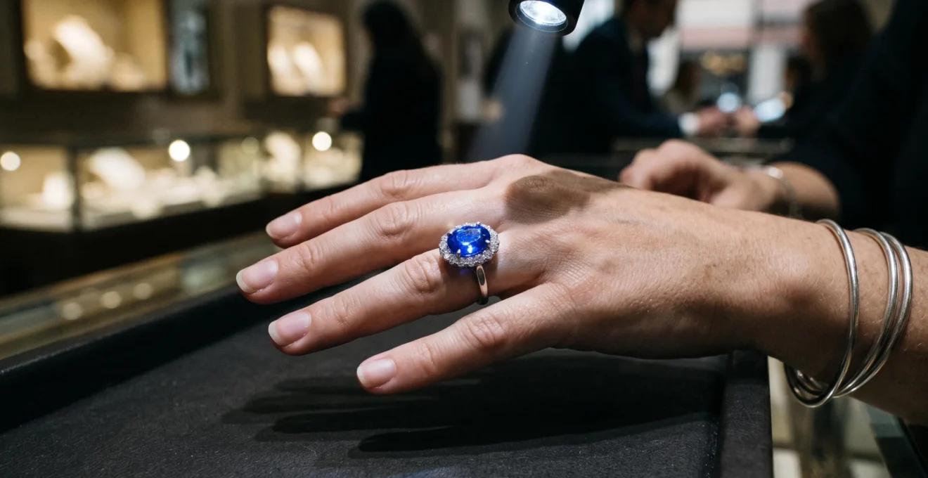
A coloured gemstone can look electric blue beneath a jewellery counter spotlight and almost grey under an office LED without undergoing any physical change. The difference often comes from the light reaching the stone, the way its facets return that light to the eye, and the balance between its colour saturation and darkness. A spectacular showroom appearance is therefore not, by itself, proof that a gemstone will look equally vivid in everyday conditions.
For buyers choosing a sapphire, ruby, emerald or spinel ring, the important question is not simply whether the stone has a beautiful colour. It is whether that colour remains attractive in the lighting where the ring will actually be worn. A deep blue sapphire may look extraordinary in bright daylight but lose its visible blue in a dim office. A lighter stone may appear less dramatic in the shop yet retain more brightness throughout the working day.
The practical solution is to assess three things separately: the light source, the gemstone’s optical behaviour and its underlying colour characteristics. Testing these variables before completing a purchase can reveal whether a disappointing change is a normal response to lighting, a cutting issue or a mismatch between the stone and its intended use.
The essentials of gemstone vibrancy
- Lighting changes perceived colour: spectrum, colour temperature and colour-rendering quality all matter, but none guarantees a vivid result.
- Cut, tone and saturation determine whether a gemstone returns enough light to look colourful rather than dark, grey or washed out.
- Inspect the same stone under indirect daylight, warm indoor lighting and neutral office-style LED before paying in full.
- Why Can a Vibrant Gemstone Suddenly Look Grey Under LED Lights at Home?
- How to Test a Gemstone’s Colour in 3 Light Sources Before You Pay in Full?
- High Saturation or High Brightness: Which Looks Better in Daylight for Most Skin Tones?
- The Photo Trick That Makes Average Gemstones Look « Vibrant » and Adds 30% to the Price
- The Best Vibrant Gem Choices if You Mostly Wear Black, Navy, or Neutrals to Work
- Why Does a Sapphire Sometimes Show a See-Through Window Under Desk Lighting?
- How to Judge Natural Saturation Using a White Paper Test and 2 Lighting Checks?
- Why Do Some Sapphires and Rubies Look « Inky » Indoors but Great in Sunlight?
Why Can a Vibrant Gemstone Suddenly Look Grey Under LED Lights at Home?
A gemstone can look grey under an LED because its colour depends on the wavelengths available in the light illuminating it and the wavelengths its material absorbs. If a light source supplies relatively little energy in the spectral regions that contribute to the stone’s visible colour, the gemstone may appear less vivid. The stone has not necessarily deteriorated; the viewing conditions have changed.
Colour in corundum, the mineral family containing sapphire and ruby, illustrates this mechanism. Chromium contributes to pink and red colours, while iron and titanium interactions contribute to blue. The observed result also depends on the concentrations of these colour-producing elements, the optical path through the stone, its orientation and the illumination. Research published in *Gems & Gemology* demonstrates that changing the illumination can substantially alter a ruby’s perceived colour without changing its composition. The Gems & Gemology research on the causes of colour in corundum provides the scientific basis for understanding this effect.
The distinction between **correlated colour temperature (CCT)** and **colour-rendering quality** is equally important. CCT describes whether a light looks warm or cool; the colour rendering index (CRI) estimates how faithfully it renders object colours relative to a reference. A warm 2700K lamp and a cool 5000K lamp can therefore produce different impressions of the same sapphire. A high-CRI source may improve colour fidelity, but neither CCT nor CRI alone predicts exactly how a particular stone will appear.
The U.S. Department of Energy explains these separate lighting characteristics in its technical guide to LED colour quality. LED products vary considerably, and cool-white lighting does not automatically make every gemstone dull.
Jewellery counters can further exaggerate the difference. Bright, carefully directed spotlights create intense reflections and strong visual contrast, while everyday rooms may offer weaker or less favourable illumination. That is a difference in presentation, not necessarily deliberate deception.
A grey-looking stone is consequently not proof of a fake or a loss of quality. If the colour returns in indirect daylight, the change may be entirely consistent with its optical response. If it remains persistently dull across different lighting conditions, examine its cut, darkness and transparency before drawing conclusions.
The key diagnostic question is whether the stone changes mainly with illumination or remains dark and lifeless even when the light improves. That distinction determines what to test next.
How to Test a Gemstone’s Colour in 3 Light Sources Before You Pay in Full?
The most useful pre-purchase test is to inspect the same gemstone face-up under indirect daylight, warm indoor light and neutral office-style LED. Keep the stone’s position, background and viewing distance as consistent as possible. Comparing the three conditions reveals whether the colour remains attractive in the environments where the ring will actually be worn.
Start with **indirect daylight**, ideally beside a window in the morning without direct sun striking the stone. Next, examine it under a warm indoor lamp. Finally, use a neutral-white office-style LED. These sources are practical comparison conditions, not a guarantee that every home or office lamp will produce the same result. Record whether the gemstone appears bright, dark, grey, washed out or consistently colourful.
Place the stone face-up on a plain, neutral surface rather than holding it directly against a bulb. Avoid mixing window daylight with overhead LED during the comparison: the combined light can obscure which source is responsible for the appearance. Also note the direction of the light, because changing the viewing angle alters which facets return light towards the eye.
Your eyes also adapt to surrounding colour. After looking at a warm light for a while, its yellow cast can begin to feel normal, making an accurate comparison harder. Briefly look at a neutral white surface between tests, then return to the gemstone. This is a practical way to reduce the influence of visual adaptation, although it cannot replace controlled colour measurement.
Payment arrangements matter, too. Where a seller offers a deposit, inspection period or conditional final payment, ask to complete the comparison before the remaining balance becomes due. Policies vary by seller and jurisdiction, so confirm the terms in writing rather than assuming that an inspection right automatically exists.
Your five-step gemstone inspection record
- Inspect the stone in indirect daylight and record its apparent hue, brightness and saturation.
- Repeat under a warm indoor lamp and note whether the colour becomes warmer, darker or less distinct.
- Repeat under a neutral office-style LED and record any greyness, black areas or loss of visible colour.
- Keep the stone face-up on the same neutral surface and record any changes caused by tilting or changing the light direction.
- Obtain written confirmation of the return, inspection and final-payment terms, together with the seller’s description of the gemstone and any laboratory report.
A stone that remains attractive across all three sources is a more practical choice for varied daily environments. If its appearance changes sharply, decide whether that limitation suits your routine before committing to the purchase.
High Saturation or High Brightness: Which Looks Better in Daylight for Most Skin Tones?
Neither high saturation nor high brightness is universally better. A strongly saturated gemstone can retain a recognisable, intense colour, but a dark tone may make it appear nearly black indoors. A lighter, brighter stone may remain lively in weaker light, yet look less intense in direct daylight. The better choice depends on the balance between colour strength, light return and the environments in which the ring will be worn.
Saturation describes the strength or purity of a perceived colour; tone describes how light or dark it appears. Brightness, in practical gemstone assessment, concerns how much light the stone returns and how lively it looks face-up. These characteristics interact, but they are not interchangeable. A sapphire can be intensely blue and still look dark if it absorbs much of the available light or its facets return little light towards the viewer.
For someone who spends most of the day in an office, a medium-tone gemstone with strong face-up brightness can be more satisfying than a very dark stone with impressive saturation in sunlight. For someone who regularly wears jewellery outdoors or in bright, warm-lit settings, deeper saturation may be worth prioritising, provided the stone remains visibly colourful in weaker light.
Skin tone can influence contrast, but there is no universal rule that a particular gemstone is best for every complexion. A cool blue sapphire or green emerald may stand out against some warm-toned skin and clothing combinations, while another wearer may prefer a warmer red, pink or orange stone. Compare the actual stone against your hand in ordinary lighting instead of relying on generalised skin-tone charts.
Wardrobe matters as well. A dark blue stone against navy fabric may appear less distinct, while a lighter blue or contrasting green can create a clearer visual separation. The metal setting adds another variable: yellow gold can introduce a warm visual context, whereas white metals can reinforce a cooler overall impression. Neither metal can correct poor cutting or guarantee a more saturated gemstone.
For a daily-wear ring, prioritise a colour that remains recognisable, a face-up appearance that does not collapse into darkness, and a cut that distributes brightness consistently. Maximum saturation on a specification sheet is not necessarily the same as maximum visual enjoyment.
The most useful purchase is not automatically the darkest or most intensely coloured stone. It is the one whose colour, brightness and contrast remain appealing in the settings where you will see it most often.
The Photo Trick That Makes Average Gemstones Look « Vibrant » and Adds 30% to the Price
A gemstone photograph can look dramatically more vivid than the stone does in ordinary lighting because lighting direction, background, camera exposure, colour balance and image processing all influence the final picture. A dark background may increase apparent contrast, while direct spotlights produce bright reflections on individual facets. These techniques can make a gemstone look striking without necessarily misrepresenting its physical properties.
The claim that this presentation adds precisely 30% to a gemstone’s price cannot be established from the available evidence. Attractive presentation can influence buyers’ perceptions, and vivid stones may command higher prices for legitimate gemological reasons, but there is no substantiated market-wide figure here that isolates a 30% premium attributable to photography.
The Gemological Institute of America explains how backgrounds, direct and diffused lighting, camera angle and colour balance change gemstone photographs in its practical guide, How to Photograph Gems & Jewelry. These effects are not inherently deceptive. Professional photographs often use carefully controlled lighting to communicate a stone’s appearance clearly, but a carefully staged image cannot show how the same stone behaves in every room.
Look for signs that a listing may be presenting only its most flattering conditions:
- A stone appears exceptionally luminous against a very dark background but has no comparable image against a neutral surface.
- Bright reflections obscure large parts of the stone’s face-up colour.
- The colour looks unusually intense in a single studio photograph, with no supporting images under ordinary illumination.
- Different photographs show inconsistent hues or brightness without explaining the lighting or editing.
None of these signs proves manipulation. They indicate that the available evidence is insufficient to judge everyday appearance.
A practical response is to request a short, unedited video under ordinary indoor lighting and, if possible, another in indirect daylight. Ask the seller to keep the stone face-up and show it from several angles. A video can reveal changes that a single photograph hides, although smartphone cameras also use automatic exposure and white balance, so footage is not a perfect colour standard.
If a seller declines, ask what inspection or return options are available. Resistance alone does not prove dishonesty, but a purchase based exclusively on flattering images carries greater uncertainty.
The aim is not to distrust every polished product image. It is to distinguish a gemstone’s intrinsic qualities from the presentation choices that make one viewing condition look particularly impressive.
The Best Vibrant Gem Choices if You Mostly Wear Black, Navy, or Neutrals to Work
If your work wardrobe consists mainly of black, navy and neutral colours, look for gemstones that combine visible colour with sufficient brightness in cool indoor lighting. Medium-tone sapphires, spinels, garnets and lighter emeralds are possible starting points, but no species or colour guarantees a vivid result. The individual stone’s tone, saturation, cut and response to your office lighting matter more than its name alone.
Black clothing can provide strong contrast against a colourful gemstone, making the stone stand out clearly. However, a very dark gemstone may also merge visually with the clothing, especially in a dim room. The result can be a ring that looks dramatic in a bright jewellery shop but appears almost black at a desk.
Navy creates a more specific challenge for blue gemstones. A dark blue sapphire, blue spinel or tanzanite may blend into the fabric instead of providing a distinct point of colour. If navy dominates your wardrobe, compare the gemstone against the actual material. A lighter blue can create separation, while a contrasting hue such as green, fuchsia or orange may be easier to distinguish.
Neutral clothing gives you more flexibility. A green emerald, red or pink spinel, garnet or medium-tone sapphire can all work, depending on the stone’s actual appearance. Avoid selecting solely from online colour labels: two gemstones described as the same shade may differ substantially in darkness and brightness.
Metal choice can refine the overall appearance. Yellow gold introduces a warm visual contrast that may suit some stones, while white gold or platinum creates a cooler frame. The metal can change the impression of the complete ring, but it does not change the gemstone’s intrinsic absorption characteristics.
A useful wardrobe-first method is to identify your three most frequently worn work colours, then shortlist stones whose hues contrast with those colours and whose face-up brightness holds up under your usual office light. Bring a fabric swatch or photograph of your clothing when inspecting rings. Compare the candidate stones against it in person rather than making the decision from a display case alone.
The strongest match is a combination of colour contrast and reliable brightness, not simply a gemstone with the highest price or deepest colour grade.
Why Does a Sapphire Sometimes Show a See-Through Window Under Desk Lighting?
A sapphire shows a window when part of its centre allows light to pass through the stone instead of returning it towards the viewer. The affected area can look pale, washed out or glassy while the surrounding facets retain stronger blue colour. This is an optical effect associated with the stone’s cut, particularly its pavilion proportions, rather than proof that its material lacks colour.
Faceted gemstones rely on their angles to redirect light. If the pavilion geometry does not return enough light towards the observer across the central area, the gemstone can display a transparent-looking region when viewed face-up. A window is distinct from extinction, where facets appear very dark because little light returns to the observer. Both effects can reduce the consistency of the stone’s visible colour, but they have different optical causes.
The Gemological Institute of America discusses these mechanisms in its technical treatment of darkness, brightness and windowing in coloured gemstones. The analysis explains why a gemstone’s apparent darkness can result from absorption, facet-related extinction, windowing or reflections from its surroundings.
To inspect a sapphire, place it face-up on a neutral surface and gently tilt it under a single light source. Watch the centre as the angle changes. If a pale region repeatedly appears while the surrounding facets remain coloured, the stone may have a window. Repeat the observation under a second lighting condition before making a decision, because one viewing angle cannot establish the full cutting performance.
A phone torch may help provide a localised light source for an informal inspection, but it is not a definitive grading instrument. A jeweller can examine the proportions and face-up appearance more systematically.
A window should not automatically disqualify a sapphire. The important questions are how extensive it is, how consistently it appears and whether it compromises the appearance you want. A stone that looks brighter because it has a pale centre may still be less attractive than one with more even colour across its face. Conversely, a very dark stone without an obvious window may not be the better everyday choice.
The goal is a balanced face-up appearance: enough brightness to keep the gemstone lively, with enough colour coverage to avoid a distracting pale centre in the lighting you use most.
How to Judge Natural Saturation Using a White Paper Test and 2 Lighting Checks?
A white-paper comparison helps you assess a gemstone’s apparent colour against a familiar neutral background, but it cannot establish whether the colour is natural or treated. Use plain white paper under indirect daylight and cool-white LED, keeping the stone face-up and the surrounding conditions as consistent as possible. The difference between the two observations provides a practical indication of how dependent the stone’s appearance is on its lighting.
White paper is useful because it provides a simple visual reference. Instead of looking at the gemstone against a colourful display or dark jewellery box, you can observe its apparent hue, darkness and brightness against a neutral surface. The background itself can still influence perception, so this is a comparative inspection rather than a calibrated gemmological measurement.
For the first check, use indirect daylight and record the stone’s apparent colour, saturation and brightness. For the second, use cool-white office-style LED and record the same characteristics. Ask three questions: Does the hue remain recognisable? Does the stone become substantially darker? Does a previously colourful centre become pale or grey? A large difference between the two observations suggests that the gemstone may be less predictable in your everyday lighting.
Colour stability across these two checks is useful for choosing a stone that will be worn in both environments. However, a colour shift does not establish that a gemstone is synthetic, dyed or otherwise treated. Natural gemstones can change appearance under different illumination, and treated stones can also display colour that looks consistent in ordinary conditions.
Likewise, colour that appears uneven under magnification is not sufficient to identify a treatment. Inclusions, fractures, growth features and treatments require interpretation by a qualified gemmologist. If natural origin or treatment status affects the purchase price, obtain an appropriate independent laboratory report rather than relying on a paper test.
The white-paper comparison should therefore be treated as a practical buying screen, not a substitute for certification. It works best after the three-source inspection and before final payment, when there is still time to ask questions or reconsider the purchase.
A gemstone that looks consistently attractive is a promising candidate for daily wear, but appearance alone cannot authenticate its origin or establish that it has received no treatment. Those questions require evidence appropriate to the specific stone and the claims being made.
Key takeaways
- Judge a gemstone in the lighting where you will wear it most, not only under a showroom spotlight.
- Look for a balanced combination of brightness, visible colour and even light return; high saturation cannot compensate for a stone that looks nearly black.
- Separate visual performance from authenticity: lighting tests reveal appearance, while treatment and origin claims require suitable gemmological evidence.
Why Do Some Sapphires and Rubies Look « Inky » Indoors but Great in Sunlight?
Sapphires and rubies can look inky indoors because their dark tone and strong light absorption leave relatively little light returning towards the eye in dim conditions. Under brighter daylight, more available illumination can make their colour easier to perceive. The apparent change does not necessarily mean the gemstone has lost quality; it can reflect the interaction between its material, cut and the spectrum and intensity of the light.
Tone is central to this effect. A very dark blue sapphire may retain strong blue saturation as a material characteristic but appear almost black when insufficient light returns from its facets. A dark ruby can behave similarly. In bright conditions, the red or blue becomes more apparent; in weaker indoor light, the gemstone may lose visible colour and seem opaque.
Chemistry contributes to the underlying absorption. In corundum, chromium is associated with red and pink coloration, while iron-titanium interactions contribute to blue. The precise appearance also depends on the concentrations and distribution of colour-producing elements, the optical path through the stone, crystal orientation and illumination. Different gemstones therefore have different responses, and the behaviour of one sapphire cannot be assumed to predict every sapphire or ruby.
Cutting introduces another variable. A window can allow light to pass through without returning towards the observer, producing a pale centre. Extinction can create dark facet areas, while strong absorption can make much of the gemstone appear dark. These are distinct phenomena, and inspecting the stone from several angles helps identify which may be contributing to the overall appearance.
For a buyer who spends most of the day in an office, a lighter-tone sapphire or a bright spinel may provide more dependable visible colour than an exceptionally dark sapphire. For someone who mainly wears jewellery in daylight or brighter settings, a deeply saturated stone may be a satisfying choice, provided its indoor appearance remains acceptable.
The decision should follow a repeatable inspection rather than a general claim about which gemstone is best. Compare the same stone in indirect daylight, warm indoor light and office-style LED; examine its face-up brightness and look for windows or excessive darkness; then judge it against your normal wardrobe and setting.
If the stone disappoints two weeks after purchase, the likely explanations to investigate are the difference between showroom and everyday illumination, the balance of tone and saturation, cutting-related light return, or the contrast created by clothing and metal. These factors can interact, so a single observation is rarely enough to identify the cause.
Choose the gemstone whose colour remains appealing in your real routine, and confirm any important origin or treatment claims through appropriate documentation. A carefully inspected stone may look less theatrical under a shop spotlight yet deliver the more satisfying everyday ring.
Can ordinary office lighting permanently change a sapphire’s colour?
A sapphire can appear darker, greyer or less saturated under office lighting without undergoing a permanent change. The perceived colour depends on illumination, the stone’s absorption characteristics and its cut. The evidence discussed here does not establish that ordinary office lighting causes a sapphire to lose saturation permanently. If the colour change persists under different conditions or appears unusual, seek an assessment from a qualified gemmologist.
Is a high-CRI LED always best for viewing coloured gemstones?
A high-CRI LED can render colours more faithfully than a lower-CRI source, but CRI alone cannot guarantee that every gemstone will look vivid. Colour temperature, spectral distribution, intensity, viewing angle and the stone’s own optical properties also matter. Compare the actual gemstone under the lighting conditions relevant to your daily wear.
Does a pale centre always mean a sapphire is poorly cut?
A pale or see-through centre may indicate windowing, which occurs when the pavilion facets fail to return sufficient light towards the observer. However, one viewing condition is not enough to assess the entire cut. Tilt the stone gently, examine it face-up under different light directions and ask a jeweller to assess its proportions and overall light return.
Can a white-paper test tell whether a gemstone is natural or treated?
No. White paper provides a useful neutral background for comparing apparent colour, but it cannot reliably distinguish natural colour from treated colour or prove natural origin. If these characteristics affect the price or your buying decision, request a suitable independent gemmological laboratory report.
Should I choose a lighter gemstone if I work under LED lighting all day?
A lighter-tone gemstone with good face-up brightness may be a sensible starting point because it can retain more visible colour in weaker indoor light than a very dark stone. However, tone alone is not decisive. Compare candidate stones under the actual office-style lighting you use and assess their saturation, cut and overall appearance before choosing.