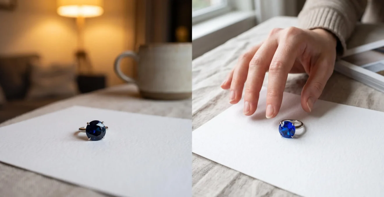
A sapphire that looks electric blue in an online listing can appear nearly black in a restaurant, strangely intense in direct sunshine, or unexpectedly dull against your favourite clothes. That change does not automatically mean the gemstone is artificial, treated or misrepresented. It often reflects the interaction between colour saturation, tone, absorption, cutting proportions and the light surrounding the stone.
Saturation describes the strength or purity of a hue, while tone describes how light or dark that colour appears. Brightness depends partly on how effectively a gemstone returns light to the viewer. These qualities interact, but they are not interchangeable. A highly saturated stone can be luminous, and a moderately saturated stone can be poorly cut or dark.
For buyers who prefer vivid colour without an exaggerated appearance, the useful question is not whether a gemstone has maximum saturation. It is whether its colour remains attractive in the places where it will actually be worn. Comparing daylight, household illumination, photographs and the stone’s appearance against skin provides a more realistic buying standard.
What matters most when judging gemstone saturation
- Rich colour is not the same as brightness. Strong absorption, dark tone and poor light return can make a vivid gemstone appear inky.
- Lighting changes the impression. Compare the stone in open daylight, warm indoor lighting and directional desk light before deciding.
- Appearance cannot establish treatment history. Photographs and household tests help assess beauty, but reliable treatment identification may require professional laboratory examination.
- Why Can High Saturation Make a Gem Look Too Dark Indoors After 6 pm?
- How to Judge Natural Saturation Using a White Paper Test and 2 Lighting Checks?
- Deeper Colour or Brighter Look: Which Should You Choose for an Everyday Ring?
- The Listing-Photo Red Flag That Signals Boosted Saturation in Online Gem Sales
- When Should You Choose Lower Saturation if You Wear Warm Metals and Earth Tones?
- High Saturation or High Brightness: Which Looks Better in Daylight for Most Skin Tones?
- Why Does a Sapphire Sometimes Show a See-Through Window Under Desk Lighting?
- Why Do Some Sapphires and Rubies Look ‘Inky’ Indoors but Great in Sunlight?
Why Can High Saturation Make a Gem Look Too Dark Indoors After 6 pm?
A highly saturated gemstone can appear excessively dark under evening lighting when strong absorption, deep tone or limited light return leaves too little visible colour reaching the eye. Warm household lamps can make this difference more noticeable than bright daylight. The effect is not caused by the clock: it depends on the illumination available and the gemstone’s optical characteristics.
Colour originates partly from selective absorption. A blue sapphire absorbs some wavelengths of visible light while transmitting others, producing its characteristic colour. When absorption is strong, less light may remain available to return through the crown of the stone. Its cut then determines how much of that light reaches the viewer.
According to GIA’s research on colored gemstone darkness and brightness, absorption, extinction, windowing and reflections from the surroundings can all affect a faceted gemstone’s appearance. Excessive dark contrast may overwhelm an otherwise attractive saturated colour.
The familiar evening effect emerges from several conditions acting together:
- Lower illumination: less available light can make the coloured return harder to appreciate.
- Different spectral distribution: warm light sources may supply a different balance of wavelengths from daylight, affecting perceived hue.
- Dark facets: certain viewing angles can produce substantial extinction, making portions of the gemstone look black.
- Reflections: dark clothing, surroundings or the observer can influence the contrast visible in polished facets.
A deep blue sapphire may look richly coloured near a window but become almost navy-black under a dim restaurant lamp. A pale aquamarine can present a different problem: rather than becoming inky, it may lose visual presence against its surroundings.
The practical solution is an evening-light comparison. Examine the gemstone under the kind of lamp used at home, preferably at the brightness normally experienced during dinner or relaxation. Rotate it slowly and observe whether coloured facets remain visible.
Six o’clock is a convenient reminder, not a scientific threshold. A gemstone that looks excellent at midday but lifeless indoors is not necessarily defective, although it may be unsuitable for someone who wears jewellery mostly in the evening.
How to Judge Natural Saturation Using a White Paper Test and 2 Lighting Checks?
A white paper comparison and two lighting checks can help you judge whether a gemstone’s colour looks balanced, lively and consistent in ordinary conditions. Place the stone against plain white paper under neutral lighting, repeat the observation in daylight, then examine it under warm indoor light. These checks assess appearance; they cannot prove that the colour is natural or untreated.
White paper provides a relatively neutral visual background that reduces some colour distractions. For a loose transparent gemstone, it can also make certain patterns of colour zoning, uneven brightness or excessive transparency easier to notice.
Use the following sequence:
- Place a clean, loose gemstone on plain white paper beneath a neutral white lamp. Avoid combining different light sources during the first observation.
- Look directly at the face-up stone, then tilt it gently. Record its dominant hue, apparent tone, bright facets and dark areas.
- Move to indirect natural daylight, ideally outdoors in open shade. Check whether the hue and visible colour distribution change.
- Examine it under ordinary warm household lighting. Note whether the centre becomes dark, whether bright areas disappear or whether the overall colour remains pleasing.
- Compare the gemstone against skin or a neutral fabric and record which setting gives the most representative appearance for your intended use.
Colour concentrated along cracks or certain facet junctions can sometimes warrant professional investigation. However, naturally occurring colour zoning, uneven illumination and reflections can also produce irregular patterns. Conversely, uniform colour is not evidence that a stone is synthetic or dyed.
For online purchases, ask the seller to reproduce these viewing conditions. Photographs on white paper, on skin and under two identified light sources are more informative than several nearly identical studio shots. Smartphone automatic white balance can still alter perceived colour, so the images should be used comparatively rather than as exact colour measurements.
Professional identification is a separate matter. GIA’s colored gemstone laboratory analysis process explains how controlled colour assessment, microscopy and specialised instruments help identify gemstone characteristics and detectable treatments. A household white paper test cannot replace those procedures.
Five checks to complete before buying a coloured gemstone online
- Request a face-up image on plain white paper under neutral light; save the image with the stated lighting condition.
- Request an open-shade daylight image or video; record whether the hue remains appealing.
- Request a warm indoor-light video with gentle rotation; note any excessive darkness or loss of colour.
- Ask for a close-up tilt video against a neutral background; record visible windowing, zoning or dark facets.
- Obtain written treatment information and the return policy; save both documents alongside the listing.
The aim is to eliminate unpleasant surprises about how the gemstone looks in real life. Questions about dye, diffusion, heat treatment or synthetic origin require appropriate disclosure and, where valuable enough to justify it, independent gemological examination.
Deeper Colour or Brighter Look: Which Should You Choose for an Everyday Ring?
For an everyday ring, a gemstone with strong but not excessively dark colour and good light return is often more versatile than one selected solely for maximum apparent depth. Rich colour creates visual intensity, while brightness helps the stone remain lively under changing illumination. The better choice depends on your daily environment, preferred aesthetic and willingness to maintain the jewellery.
A deeply coloured sapphire can offer a dramatic velvet-like appearance. A brighter sapphire may show more individually illuminated facets and stronger colour variation as the hand moves. Neither is automatically more valuable or better cut merely because of its appearance.
Consider how the ring will actually be worn:
| Wearing context | Useful colour priority | What to check |
|---|---|---|
| Office and indoor-heavy days | Good brightness and moderate-to-strong saturation | Colour remains visible under overhead and desk lighting |
| Outdoor and weekend wear | Rich saturation with sufficient light return | Stone stays lively in sun and open shade |
| Mixed indoor and outdoor wear | Balanced tone, saturation and brightness | No major visual collapse between lighting environments |
| Evening-focused jewellery | Colour performance in low illumination | Acceptable darkness under typical household or restaurant lighting |
Daily maintenance is another consideration. Skin oils, lotions and soap film can interfere with light entering and leaving a gemstone. A darker stone with limited visible light return may appear especially subdued when dirty, although this is not a universal consequence of high saturation.
Durability itself is a separate property. Resistance to scratching and wear depends on the gem material, its inclusions, setting, exposure and care. Saturation does not make a gemstone inherently less durable. Sapphires and rubies can be practical jewellery choices, but their mounting and condition still matter.
Rather than judging only a still photograph, watch how bright and dark facets change while the ring moves. A pleasing balance of coloured light, contrast and transparent depth generally contributes more to day-to-day satisfaction than a single saturation descriptor.
For a ring worn from morning until evening, a balanced gemstone that retains character across lighting conditions may provide more lasting enjoyment than one that looks spectacular only in a display case.
The Listing-Photo Red Flag That Signals Boosted Saturation in Online Gem Sales
A warning sign in online gemstone listings is intensely vivid colour presented without enough variety in lighting, angle or background to evaluate it realistically. Nearly identical colour across every photograph deserves closer questioning, but it does not prove editing or treatment. Controlled professional photography can also produce consistent results, so buyers should seek additional evidence rather than make accusations from images alone.
Digital saturation adjustments can increase colour intensity without changing the physical gemstone. Lighting, exposure, white balance and surrounding colours can also create a more flattering appearance.
GIA’s gemstone photography recommendations explain the importance of backgrounds, illumination and viewing angles. Diffused light can reveal colour effectively, while direct illumination may create dark areas or bright reflections. White backgrounds can assist colour balance; darker backgrounds can heighten contrast.
When assessing a listing, examine several photographic features together:
- Lighting disclosure: images labelled daylight, studio lighting or indoor light are more informative than images with unspecified illumination.
- Background consistency: compare the stone against both white and neutral backgrounds when possible.
- Facet detail: inspect whether bright and dark internal reflections remain distinguishable instead of becoming a flat block of colour.
- Viewing angles: look for face-up, tilted and side views rather than relying on a single carefully chosen position.
- Image processing: ask whether colour-enhancing filters or major saturation edits were used.
Severe colour clipping, unusual colour fringes or absent facet detail can justify requesting new images. None of these features independently identifies manipulation: camera exposure, compression and optical effects may produce similar appearances.
Photographic enhancement must also be distinguished from gemstone treatment. Heat treatment, diffusion and dyeing are physical or chemical interventions affecting the material. A photograph cannot reliably establish whether any of these procedures occurred.
For consumer protection, obtain written treatment information, clarification of significant enhancements and clear return conditions. FTC consumer advice on buying gemstones recommends asking about treatments and reviewing the seller’s return policy. Its legal guidance applies to the United States and should not be assumed to describe the law in every English-speaking country.
A short, unfiltered rotation video taken under an ordinary household lamp often contributes more to a confident purchase than another polished promotional photograph. If a seller cannot provide meaningful additional information, uncertainty about the stone’s real-world appearance remains part of the buying decision.
When Should You Choose Lower Saturation if You Wear Warm Metals and Earth Tones?
Moderately saturated gemstones can be an appealing choice with yellow gold, rose gold and earth-tone clothing when maximum colour intensity makes the overall combination feel visually heavy. Softer colour can create a more integrated effect, especially in everyday jewellery. However, the interaction depends on the gemstone’s hue, tone, setting and your personal preferences, rather than a fixed rule about warm metals.
Yellow gold introduces warm reflections around the gemstone. Terracotta, camel, olive, chocolate and beige clothing create additional colour context. A vivid cool-blue sapphire may stand out sharply against these surroundings, producing deliberate contrast. A softer blue, green or peach-toned gem may create a quieter relationship.
Neither approach is inherently more natural. A strongly saturated sapphire can be completely natural and visually harmonious beside yellow gold. Conversely, an artificially coloured gemstone can have relatively low saturation.
To evaluate harmony, compare three elements together: the gem’s hue, its darkness and the surrounding metal. Two stones with similar saturation may behave differently if one has a medium tone and the other is very dark.
A useful wardrobe experiment is to photograph the stone beside the clothes and jewellery worn most frequently. Use the same lighting and camera settings for each comparison. Try a cream fabric, a favourite darker garment and the intended metal finish.
Look for whether the gemstone:
- Maintains a distinct colour without overwhelming the whole combination.
- Retains enough brightness against darker clothing.
- Creates the intended contrast or harmony with the metal.
- Looks attractive in both daylight and ordinary room lighting.
Moderately saturated stones are not necessarily brighter. Brightness still depends on tone, absorption and cut. Any impression of greater lightness should therefore be confirmed by inspecting the actual gemstone.
Resale preferences introduce another distinction. Fine coloured gemstones are judged partly on colour characteristics, but desirability and price also depend on variety, origin where relevant, treatment, quality and market demand. A subdued stone selected for personal styling should not be assumed to command the same premium as a comparably fine stone with a more desirable market colour.
Choose softer saturation because it genuinely suits the way the piece will be worn, not because intense colour is necessarily unnatural. A deliberate aesthetic preference is a stronger purchasing reason than an unsupported rule about what genuine gemstones should look like.
High Saturation or High Brightness: Which Looks Better in Daylight for Most Skin Tones?
In daylight, a gemstone combining attractive saturation with strong light return will often look more balanced on the hand than one that is extremely dark or noticeably washed out. There is no established universal saturation level that flatters most skin tones. The result depends on colour contrast, lighting, cut, skin appearance and individual preference, making direct comparison more reliable than undertone rules.
Daylight allows many coloured stones to display more internal reflections than they do in dim rooms. However, direct sun is not necessarily the most revealing or flattering condition. Small bright highlights, dark reflections and strong contrast can make different facets look unusually intense.
Skin creates a colour context around the ring. Against lighter skin, a deep blue stone may create strong contrast. Against darker skin, the same gem might produce a subtler tonal relationship or an equally striking contrast depending on its brightness, the lighting and the setting.
Warm and cool undertones can provide styling ideas but should not be treated as scientific predictors of gemstone suitability. A blue sapphire may look beautiful against warm-toned skin, while a peach-coloured sapphire may complement cool-toned skin. Metal colour, clothing and personal taste can substantially affect the impression.
For a practical test, compare the ring in two daylight conditions:
- View it in direct midday sunshine while keeping the hand comfortably positioned. Observe whether the stone remains visibly coloured or becomes dominated by strong reflections and dark facets.
- Repeat the observation in open shade, where illumination is less directional. Compare colour depth, brightness and internal detail.
Photograph both situations using consistent settings if possible. Smartphone automatic exposure and colour processing may change the pictures, so visual observation remains important.
A gemstone that looks dark in direct sun is not automatically oversaturated. Facet reflections, viewing angle and cut may be responsible. Likewise, a stone that looks brighter in shade may simply be receiving more favourable diffuse illumination.
For many everyday buyers, the sensible target is not maximum saturation but a stone that retains attractive colour and brightness in both sun and shade. This remains an aesthetic selection principle rather than a scientifically established preference shared by all wearers.
Why Does a Sapphire Sometimes Show a See-Through Window Under Desk Lighting?
A sapphire can show a transparent-looking area in its centre when its cutting proportions allow light to pass through rather than return toward the viewer. This effect, called windowing, is often associated with a shallow pavilion or unsuitable facet geometry. Directional desk lighting and the background behind the stone can make an existing window especially noticeable, even when photographs previously concealed it.
In a well-designed faceted gemstone, some light entering the crown travels through the stone, reflects within the pavilion and exits toward the viewer. The result depends on refractive index, facet angles and viewing geometry.
If the pavilion is too shallow in relevant areas, light may leave through the back instead. From above, the centre can appear transparent relative to the surrounding coloured facets.
This is distinct from extinction. Windowing produces a see-through area, while extinction produces dark areas where little light reaches the observer. Both can reduce visual appeal, but they have different optical causes.
Highly saturated stones can still have windows. A deep colour may make the window less immediately obvious under some conditions, whereas an open or reflective background can reveal differences between the centre and surrounding facets.
To investigate a possible window in a loose gem, place it over printed paper and look through its centre while gently changing the viewing angle. Visible lettering or background patterns can suggest that light is passing through the gemstone. This is a practical observation, not a standardised grading procedure.
For a mounted sapphire, the test is less straightforward. Metal beneath the gemstone, reflections from the mounting and the distance between the stone and paper can obstruct the view. Ask for a face-up video against both light and dark backgrounds rather than trying to force a reliable diagnosis from a ring’s limited viewing angles.
Dark photographic backgrounds can conceal a window when the transparent portion simply appears dark. Carefully selected angles can also reduce its visibility. Neither circumstance proves intentional concealment, but multiple views help establish the stone’s actual appearance.
Windowing does not establish that the sapphire is treated, synthetic or naturally coloured. It is principally a cutting and light-path issue. A competent gem cutter or gemologist can help distinguish significant windowing from ordinary differences in facet brightness.
When an attractive saturated sapphire appears hollow under a desk lamp, examine its cutting proportions before blaming the colour. Strong saturation cannot compensate for every optical compromise, and a well-balanced cut is essential to attractive light return.
Key takeaways before evaluating sapphires and rubies
- Judge saturated colour together with tone, contrast and light return; darkness alone does not reveal whether a stone has been enhanced.
- Use several lighting environments to reveal different optical behaviours, and avoid interpreting one photograph as a complete representation.
- Separate aesthetic judgement from treatment verification: a gemstone can look natural yet be treated, or look unusually intense while being entirely natural.
Why Do Some Sapphires and Rubies Look ‘Inky’ Indoors but Great in Sunlight?
Some sapphires and rubies appear inky indoors because strong absorption, dark tone, facet-related extinction and limited illumination combine to reduce the coloured light reaching the eye. Brighter daylight may reveal more of their hue and internal brightness. The dramatic change does not automatically indicate treatment or poor quality, but it is important when evaluating a gemstone for everyday wear.
Sapphires and rubies belong to the corundum mineral family. Their colours arise from trace elements and associated absorption processes. Blue sapphires and red rubies interact differently with the visible spectrum, so their behaviour should not be reduced to a single saturation rule.
In a deeply toned blue sapphire, some facets may look almost black under ordinary indoor lighting while more vivid blue areas emerge under stronger illumination. A ruby may similarly lose visible red brightness in a dim room. Its appearance can also depend on how the light source interacts with any fluorescence, which varies among rubies.
The important distinction is between colour strength and usable coloured light return. A gemstone can have a strong hue yet show extensive darkness because the cut and absorption leave too little illuminated area visible to the observer.
Heat treatment complicates the purchasing decision but should not be used as a shortcut explanation. Heating can change colour in some gemstones, yet an inky appearance does not establish that heat treatment occurred. Untreated material may be naturally dark, and treated material may display attractive brightness and balanced colour.
Likewise, a highly saturated stone is not necessarily worth more than a brighter alternative. Value depends on the complete gemstone: colour quality, tone, transparency, cut, size, treatments, rarity and relevant market characteristics. A desirable rich blue or red should not be confused with simple darkness.
Before purchasing corundum online, request evidence of its appearance under three practical conditions:
- Open daylight: assess the dominant hue, overall colour and internal brightness without relying solely on direct sun.
- Warm indoor lighting: assess whether coloured facets remain visible under common evening conditions.
- Directional desk lighting: rotate the gemstone to examine dark areas, reflections and possible windowing.
Compare the results with the intended use. A pendant worn mainly outdoors may tolerate a different balance from a ring worn in offices and restaurants. Record any significant shifts rather than describing the gemstone simply as beautiful or disappointing.
If treatment status affects the asking price, request the seller’s written representations and an appropriate laboratory report. Visual comparisons help determine whether you enjoy the gemstone’s appearance; they cannot establish a reliable treatment history.
Before committing to a gemstone, assemble the daylight, indoor and desk-light observations alongside the treatment information and written return terms. Choose the stone whose actual colour performance matches your expectations, rather than paying a premium for an intensity visible only in promotional photography.
Can a naturally coloured sapphire look unnaturally vivid?
Yes. Naturally occurring sapphires can display strikingly vivid colour, especially under favourable lighting. Strong saturation alone does not establish dyeing, diffusion, heat treatment or synthetic origin. A gemstone’s treatment history requires appropriate evidence rather than an aesthetic judgement about how intense its colour appears.
Does heat treatment always make a gemstone more saturated?
No. Heat treatment can produce different colour changes depending on the gem material and its characteristics. It may alter hue, tone or saturation and does not invariably increase colour intensity. The effect and treatment classification should be evaluated for the specific gemstone.
Can a smartphone photograph accurately show gemstone colour?
A smartphone can provide useful comparative images, but its automatic white balance, exposure, image processing and screen display can shift colour. Photographs taken under clearly identified, consistent lighting are more informative than heavily processed promotional pictures. They still cannot guarantee an exact match to what the eye will see.
Is a medium-saturation gemstone always less expensive than a highly saturated one?
No. Price depends on many interacting characteristics, including gemstone variety, hue, tone, clarity, cut, size, treatment and market demand. A lively medium-saturation stone can be more desirable than a highly saturated but excessively dark or poorly cut example. Saturation alone is insufficient for a reliable valuation.
What should buyers do when a gemstone arrives looking darker than its online photographs?
First inspect the clean gemstone under comparable lighting, including daylight and the indoor conditions used in the listing if known. Compare its appearance with the seller’s descriptions and any written treatment representations. If the difference is significant, document it promptly and review the applicable return terms and consumer rights in the purchasing jurisdiction.