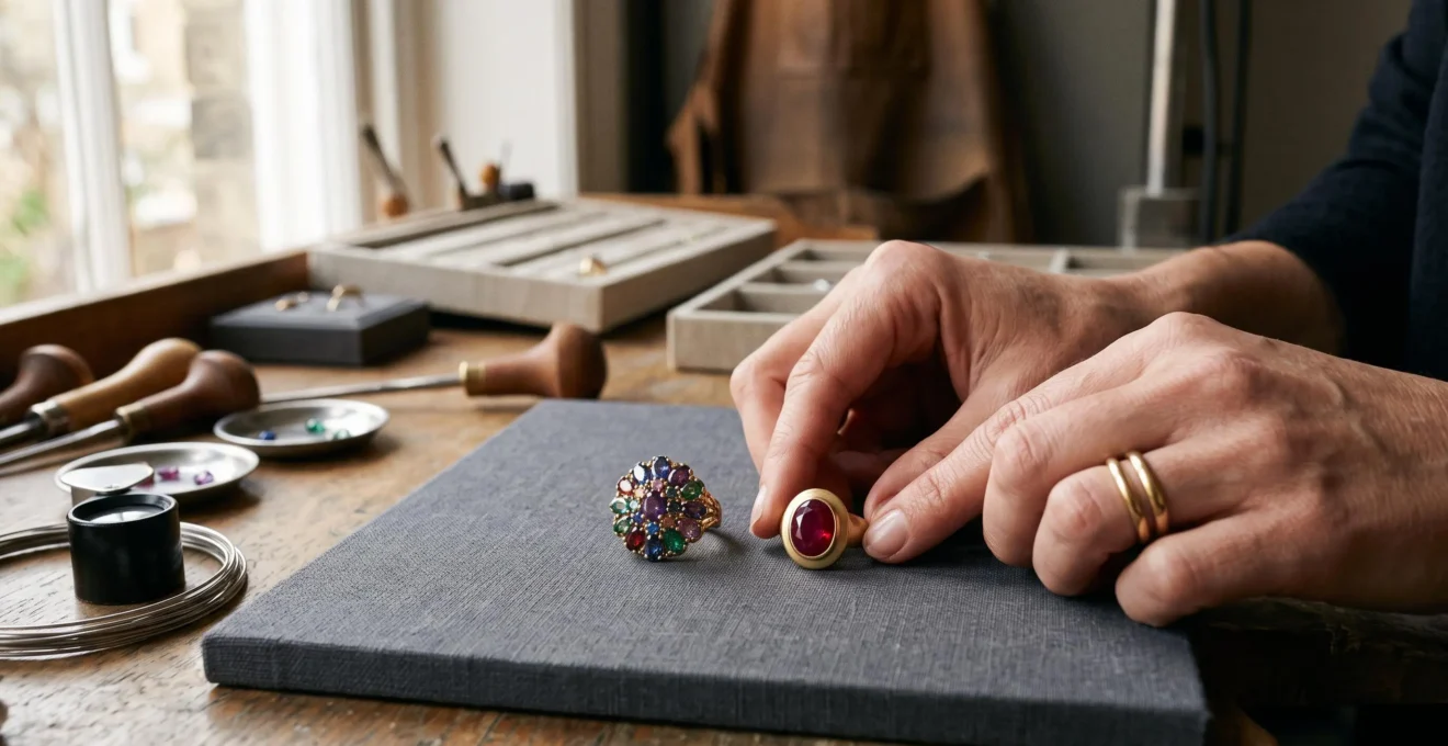
High-contrast jewellery looks chaotic when several elements compete for attention without a clear focal point. A vivid gemstone, a reflective metal, a second contrasting stone and a busy outfit can each demand to be noticed. The problem is not necessarily the colours themselves; it is how they interact in the finished look.
The most reliable approach is to establish a visual hierarchy. Choose the element that should attract attention first, then let the remaining colours, finishes and shapes support it. A deep ruby in yellow gold, for example, can create a decisive focal point without requiring every other element to be equally striking. A multicoloured ring can also look intentional when its colours share a coherent relationship and its overall design remains legible.
This principle extends beyond jewellery. Adobe‘s tutorial on the basic principles of graphic design explains how contrast, scale, emphasis and visual hierarchy organise attention within a composition. These principles offer a useful framework for styling jewellery, although they do not establish universal rules for how people will perceive every combination.
The practical objective is simple: **make contrast deliberate, not indiscriminate**. Once the focal point is clear, choosing stones, metals and supporting accessories becomes much easier.
High-Contrast Jewellery: The Essentials
- Give one colour, stone or design element visual priority instead of allowing several competing accents to dominate equally.
- Build a coherent palette by considering metal colour, gemstone hue, brightness, saturation and the colours already present in your outfit.
- Control the number of independent contrasts. A bold statement piece usually needs simpler supporting jewellery, not additional competing focal points.
- Why Does Contrast Look Intentional When One Colour Dominates the Piece?
- How to Build a Contrasting Jewellery Palette Without Clashing: A 3-Colour Method
- High Contrast or Subtle Contrast: Choosing the Right Level for a Conservative Workplace
- The Stacking Mistake: Why 3 Contrasts at Once Looks Overdone — and How to Fix It
- When to Buy a High-Contrast Piece if You’re Building a Capsule Wardrobe
- High Saturation or High Brightness: What Reads Best in Daylight Across Most Skin Tones
- How to Test Whether a Geometric or Natural Piece Matches Your Wardrobe: The 3-Outfit Test
- Geometric Precision or Natural Motifs: Which Design Direction Fits Your Daily Wear?
Why Does Contrast Look Intentional When One Colour Dominates the Piece?
Contrast looks intentional when the eye can identify a dominant element and interpret the other colours as supporting accents. When several colours have similar visual weight, attention moves between them instead of settling on a focal point. A dominant colour therefore provides structure, making a bold combination easier to read without necessarily reducing its intensity.
### Dominance matters more than the number of colours
Consider a ruby-and-diamond ring set in yellow gold. The ruby may occupy the largest visible area, while the diamonds contribute flashes of light and the gold frames the central stone. Although the ring contains several visually distinct elements, they do not necessarily compete equally. The design establishes a natural order: ruby first, diamonds second, metal as the supporting structure.
Now compare it with a rainbow cocktail ring featuring several similarly sized, highly saturated stones. If each stone attracts attention independently and the setting adds another prominent colour, the eye has no obvious starting point. The result can feel busy even if the ring contains fewer stones than a more carefully composed multicoloured design.
A **70/30 colour split** can be a useful starting hypothesis: allow one colour to occupy most of the visual field and use another as an accent. It is not a universal formula, however. The apparent balance depends on stone size, setting, colour intensity, metal finish and the differences in brightness between elements. A small, vivid gemstone can command attention despite occupying little physical space.
To assess dominance, look at the jewellery from a normal wearing distance and briefly squint. This is a practical styling heuristic, not a validated diagnostic test. Notice which colour remains prominent and which recedes. If the focal point becomes difficult to identify, reconsider the distribution of colour or the intensity of the supporting elements.
The aim is not to eliminate competition completely. Contrast creates interest; hierarchy gives that interest direction. A strong design allows the eye to notice the accent without losing sight of the main element.
Once dominance is established, the next decision is how the different hues, metals and finishes should relate to one another. A simple palette method helps make that decision before a piece is purchased or worn.
How to Build a Contrasting Jewellery Palette Without Clashing: A 3-Colour Method
A practical way to build a contrasting jewellery palette is to assign three roles: a base colour, a contrasting colour and an optional linking colour. The base establishes continuity, the contrast creates interest, and the linking colour connects the elements through a shared visual property. This is a styling framework, not a universal rule that every successful piece must contain exactly three colours.
### Give each colour a job
Start by identifying the metal as the base. Yellow gold, rose gold, silver and platinum-coloured metals can all establish a different visual foundation. Next, select the principal stone or enamel colour. Finally, introduce a third colour only if it strengthens the relationship between the first two.
A linking colour can share warmth, saturation or brightness with another element. For example, a yellow-gold necklace with a deep green stone might work alongside a muted green garment because the repeated green creates continuity. Alternatively, a neutral black or grey element can provide visual separation without introducing another vivid accent.
The distinction between **complementary and tonal contrast** is particularly useful. Complementary colours sit opposite one another on the colour wheel and create a pronounced difference in hue. Tonal contrast uses differences in lightness or darkness within a related colour family. Both can work; the choice depends on how much visual tension the outfit should contain.
Adobe’s explanation of colour wheel combinations distinguishes complementary, analogous and triadic colour relationships. It also highlights the importance of lightness and saturation alongside hue. These are useful principles for jewellery styling, but they do not prescribe a mandatory three-colour limit or prove that complementary colours always need a neutral buffer.
Remember that metal is part of the palette. Yellow gold with blue and green stones may already create three distinct colour elements. That is not automatically a problem; the important question is whether those elements form a coherent composition.
### A five-step palette check
Build a Wearable Contrast Palette
- Lay the proposed jewellery pieces together and record the metal colour as the base of the palette.
- Identify the main stone or enamel colour and mark it as the intended focal point.
- Write down any third prominent colour and identify its shared property with the base or focal colour: warmth, saturation or brightness.
- Photograph the arrangement and note which element attracts attention first.
- Remove or replace one competing accent, then photograph the revised arrangement and compare the two versions.
If the palette still feels unsettled, do not automatically discard the second stone colour. First check whether the metal is introducing another strong contrast or whether the stones differ sharply in both hue and brightness. Simplifying one relationship may be enough to restore balance.
A coherent palette solves only part of the problem. The same combination can feel expressive at a social event and distracting in a formal meeting, so the next decision is where to concentrate the contrast.
High Contrast or Subtle Contrast: Choosing the Right Level for a Conservative Workplace
High-contrast jewellery can work in a conservative workplace when the contrast is concentrated in one deliberate piece rather than distributed across several competing accessories. An onyx ring in gold or a defined black-and-silver cuff can look controlled even when its colours are striking. The appropriate level depends on the dress code, the outfit’s existing pattern and whether the jewellery is intended to attract attention.
### Decide where the contrast belongs
A useful distinction is contrast within one piece versus contrast between several pieces. A single ring can combine a dark stone with a bright metal while keeping the rest of the outfit visually quiet. Several necklaces, coloured earrings and mixed-metal bracelets may create multiple focal points even if each piece looks attractive on its own.
The location of the jewellery also matters. Earrings and necklaces sit close to the face, where they can become part of the overall impression during conversation. Rings and bracelets are generally more peripheral, although large or highly reflective pieces can still attract attention. Neither placement is inherently inappropriate; the relevant question is how much emphasis the setting calls for.
Use the following comparison to choose a starting point.
| Styling consideration | Higher contrast may suit | Lower contrast may suit |
|---|---|---|
| Dress code | Creative, client-facing or presentation-led environments where expressive accessories fit the context. | Highly formal environments with explicit expectations of restrained dress. |
| Position on the body | A single statement piece that creates one clear focal point. | Several accessories near the face, particularly when each introduces a different colour. |
| Outfit pattern | Plain or neutral clothing that leaves room for jewellery to stand out. | Busy prints, strong colour blocking or clothing with several competing focal points. |
| Communication goal | Visibility and a recognisable personal style. | Discretion, visual restraint or a setting where the attention should remain on the conversation. |
### Use one statement and keep the rest quiet
A practical workplace formula is **one statement piece, neutral supporting jewellery**. A high-contrast pendant can be paired with plain metal earrings; a bold cuff can work with a simple ring rather than a second coloured bracelet. This preserves the contrast without multiplying the number of focal points.
If a piece is striking but feels unsuitable for a particular meeting, move it to a less formal context rather than assuming it is incompatible with the wardrobe altogether. The question is not whether bold jewellery belongs at work, but whether its visual emphasis suits the situation.
That same distinction becomes even more important when jewellery is stacked. Several individually wearable pieces can produce an overdone result if each introduces a different kind of visual tension.
The Stacking Mistake: Why 3 Contrasts at Once Looks Overdone — and How to Fix It
Stacking looks overdone when several independent contrasts compete at once, not simply because too many pieces are being worn. A stack can combine colour contrast, mixed-metal contrast, texture contrast and differences in scale, giving the eye several unrelated focal points. The fix is to choose one main contrast and make the remaining elements more consistent.
### Identify the competing contrast axes
Imagine a stack of three bracelets. The first combines bright yellow gold with a saturated green stone. The second introduces silver, a rough texture and a larger silhouette. The third adds a brightly coloured enamel pattern. Each bracelet has its own visual identity, but the combination asks the eye to process several competing ideas simultaneously.
Now consider three gold bracelets with different shapes but similar finishes and proportions. They may still create variety, yet the shared metal and surface treatment give them a common visual language. The number of pieces is not the decisive factor; the number of independent contrasts is.
The most effective correction is to select one contrast axis:
– **Colour-led:** Keep the metals, finishes and approximate scale consistent while allowing gemstone colours to provide the interest.
– **Metal-led:** Combine different metal colours while keeping stones, textures and silhouettes relatively restrained.
– **Texture-led:** Mix polished and matte surfaces while maintaining a related palette and manageable scale.
– **Scale-led:** Combine different proportions within a consistent colour and finish family.
Choose the axis that best expresses the intended look, then adjust one piece at a time. If the stack becomes more coherent after removing a bracelet, identify what changed. Was the removed piece adding a second metal colour, a new texture or another oversized focal point? That diagnosis helps prevent the same problem in future combinations.
Clothing must be included in the assessment. A patterned blouse or colour-blocked dress already creates contrast. Jewellery can repeat one of those existing colours to build continuity, or it can stay relatively neutral. Introducing an unrelated set of vivid colours on top of a visually busy outfit often makes the overall composition harder to read.
### When removing a piece is not enough
Sometimes the problem is not the number of accessories but their relative quality, scale or design strength. Two small, visually unrelated pieces may compete more awkwardly than one well-proportioned statement piece. Replacing them with a single stronger design can concentrate attention and create a cleaner result.
The objective is not to make every accessory match perfectly. It is to establish a deliberate relationship between them, leaving enough consistency for the contrasts to feel connected.
Once a reliable styling approach has been established, it becomes easier to decide which contrasting pieces deserve a permanent place in a smaller wardrobe and which are better treated as occasional purchases.
When to Buy a High-Contrast Piece if You’re Building a Capsule Wardrobe
A high-contrast jewellery piece is usually best purchased after the core capsule wardrobe has been defined. Its versatility depends on the clothing it must work with, not simply on how attractive it looks in isolation. Choose a piece whose dominant colour already appears somewhere in your existing wardrobe, so its visual impact can be repeated and supported across several outfits.
### Build the wardrobe before buying the accent
A capsule wardrobe relies on a relatively small collection of clothes that work together. Neutral garments often make the foundation easier to coordinate, but the best base can also include recurring colours such as navy, olive, burgundy or muted blue.
A high-contrast accessory should reinforce that existing system rather than require a new set of clothes. A deep green stone may work across a wardrobe containing olive knitwear, navy tailoring and neutral dresses. An unusual bright orange stone may be beautiful, but if it works with only one outfit, its practical versatility is lower.
This is why a contrast piece should be assessed against real combinations. Its dominant colour needs a place in the wardrobe, while the secondary colour and metal should remain compatible with the garments that will surround it.
### One versatile piece or several inexpensive accents?
There are two viable purchasing strategies. A single well-chosen piece combining a familiar metal with one distinctive colour can work across many outfits. Alternatively, a small collection of less expensive accent pieces can offer variety for occasional wear.
The better option depends on use. Cost per wear can help make the decision:
[
ext{Cost per wear}=rac{ ext{Purchase price}}{ ext{Number of wears}}
]
For example, if a hypothetical piece costs £120 and is worn 60 times, its cost per wear is £2. If another piece costs £30 and is worn five times, its cost per wear is £6. These are illustrative calculations, not market-price estimates or predictions of future use.
The calculation should not be the only criterion. A distinctive stone colour or unusual finish may be harder to combine with other pieces, lend to someone else or resell. A more neutral statement piece may offer greater flexibility, even when both items cost the same amount.
Before purchasing, consider how often the piece will be worn, whether its colour recurs in the capsule and whether it works with the outfits already in rotation. **Versatility is a relationship between the accessory and the wardrobe**, not an intrinsic property of the jewellery alone.
Colour compatibility also depends on how a stone appears in real light. Before committing to an accent colour, distinguish colour intensity from brightness and evaluate the piece under the conditions in which it will be worn.
Key Takeaways
- Choose jewellery colours that reinforce an existing wardrobe palette rather than requiring several new outfits.
- Evaluate a stone in natural, indirect light and consider how its appearance changes with illumination and surrounding clothing.
- Choose a geometric or natural design according to the lines, textures and practical demands of everyday clothing, then test it in actual outfits.
High Saturation or High Brightness: What Reads Best in Daylight Across Most Skin Tones
Neither high saturation nor high brightness is universally better in daylight or across all skin tones. Saturation describes how intense or muted a colour appears, while brightness in everyday styling refers broadly to how light or dark the colour looks. A vivid, deeply coloured stone may create a strong focal point, while a pale, less saturated stone may blend more easily into a restrained outfit. The best choice depends on the stone, the surrounding colours, the lighting and the intended effect.
### Separate saturation from brightness
A deep emerald, garnet or lapis-blue stone can appear visually assertive because of its strong colour. A pale pink or light blue stone may appear quieter, especially when paired with similarly light clothing. But colour intensity and lightness are separate characteristics: a stone can be highly saturated and light, or muted and dark.
Gemmological analysis makes this distinction important. GIA’s technical article on pleochroism in faceted gemstones discusses hue, tone, saturation, colour zoning and optical effects that can influence a gemstone’s appearance. Certain stones can even show different colours or intensities depending on the viewing direction. A colour name alone therefore cannot predict exactly how a stone will look in every setting.
Skin tone can influence the apparent contrast between jewellery and the wearer, but broad rules have limits. Pale stones may blend with some lighter complexions and stand out more against deeper complexions; saturated stones can create noticeable contrast across a range of complexions. Neither outcome is guaranteed. The specific stone, metal, finish and surrounding colours matter, and individual preference remains relevant.
### Test the piece in the light you actually use
Lighting can change the appearance of jewellery. The Gemological Institute of America explains that diamond appearance depends on factors such as cut and illumination, and that surrounding clothing can affect how the diamond is perceived. Its guidance on how light affects a diamond’s appearance is particularly relevant when evaluating jewellery for everyday wear, although the article focuses on diamonds rather than every coloured gemstone.
Use a simple comparison:
– Examine the piece in natural, indirect daylight rather than relying exclusively on concentrated shop lighting.
– Hold it next to your face and compare it with the colours you regularly wear.
– Check the stone against both a neutral garment and one of your most frequently worn colours.
– Observe whether the colour becomes more or less prominent as the viewing angle and illumination change.
A photograph can help document the comparison, but it is not an infallible measure: camera settings, screen displays and automatic processing can alter colour appearance.
The practical choice is a balance between impact and flexibility. High saturation tends to make a colour more prominent, while a lighter or more muted stone may be easier to integrate into a restrained palette. Neither characteristic automatically makes jewellery more flattering or more wearable.
Once the colour behaves well in daylight, the remaining question is whether the piece’s shape and design language fit the clothing itself. That requires testing form as well as colour.
How to Test Whether a Geometric or Natural Piece Matches Your Wardrobe: The 3-Outfit Test
The three-outfit test reveals whether a jewellery piece works with the range of clothing you actually wear. Try it with your most-worn casual outfit, your most formal outfit and the outfit with the strongest pattern or colour. If the piece works in all three, it is a strong candidate for regular use. If it fails only with the patterned outfit, the problem may be contrast compatibility rather than a fundamental mismatch with your style.
### Test line harmony, not just colour harmony
Geometric jewellery uses defined edges, symmetry and controlled shapes. These characteristics often complement tailored jackets, clean silhouettes, structured shirts and minimalist clothing. Natural motifs use irregular outlines, organic curves or stone shapes that can complement flowing fabrics, relaxed silhouettes and more textured garments.
These are tendencies, not strict rules. A geometric pendant can look striking against a flowing dress, and an organic stone can soften a sharply tailored outfit. The key is to understand what the piece adds to the clothing: structure, softness, texture or another point of contrast.
The three-outfit test helps separate these effects. If a piece works with a plain casual outfit and formal tailoring but clashes with a patterned dress, the issue may be the interaction between its lines and the outfit’s existing visual complexity. If it feels wrong across all three, reconsider the shape, scale, metal colour or overall design before assuming that the motif itself is unsuitable.
### Make the test observable
A mirror provides immediate feedback, but a photograph can make comparisons easier. Photograph the jewellery with each outfit in similar lighting, then review the images side by side after some time away from the decision. The goal is not to treat photography as an objective verdict; it is to make differences in focal points, proportions and colour interactions easier to compare.
Pay attention to three things:
– Whether the jewellery creates one clear focal point or several.
– Whether its lines support or compete with the outfit’s silhouette.
– Whether the colour and metal remain compatible across different clothing combinations.
A piece that fails in one context may still be valuable for another. There is no need to reject a favourite geometric ring simply because it does not suit a formal dress, provided it works well with the casual and structured outfits in which it will actually be worn.
Likewise, if the piece works in all three settings but catches on fabric or hair, that is a practical fit issue rather than a purely aesthetic failure. Setting height, edges, movement and comfort should be tested alongside appearance.
The results can also reveal a broader preference: whether everyday jewellery should reinforce clean, structured lines or introduce softer, more organic forms. That distinction provides a useful basis for choosing future pieces.
Geometric Precision or Natural Motifs: Which Design Direction Fits Your Daily Wear?
Geometric precision is often the stronger choice for a wardrobe built around tailoring, clean lines and structured silhouettes. Natural motifs can be a better fit for clothing with flowing shapes, organic textures and softer details. Neither design direction is inherently more versatile: the right choice depends on the clothes, accessories and level of visual emphasis that define everyday wear. Hybrid designs offer a practical middle ground when both approaches appeal.
### Choose according to the structure of your wardrobe
Geometric pieces create contrast through form. Angular outlines, symmetry and repeated shapes can echo the structure of tailored jackets, straight-leg trousers and minimalist garments. They can also introduce a deliberate interruption in softer clothing, provided the contrast is intentional.
Natural motifs often bring attention to texture, irregular outlines and small variations in shape. They may complement draped fabrics, textured knitwear and relaxed silhouettes, or add an organic accent to otherwise simple clothing.
The distinction is not a strict division between two types of wearer. Instead, it is a question of what the jewellery contributes to the outfit. A geometric piece may reinforce the existing structure; a natural motif may soften it or introduce a different kind of detail. Either can create a compelling contrast when the remaining elements support the same overall direction.
### Use three questions to decide
First, how structured is the clothing worn most often? A wardrobe dominated by tailored pieces may benefit from crisp geometry, while one built around flowing shapes may support organic forms more naturally.
Second, how visually busy are the existing accessories? Geometric pieces can often be layered through a shared language of shape and repetition. Natural motifs can also be layered, but differences in texture, silhouette and stone colour may create competing focal points if several pieces are equally prominent.
Third, should jewellery provide visual quiet or demand attention? A simple geometric pendant can become a restrained finishing detail, while an elaborate organic piece may serve as the focal point. The reverse is equally possible: a sculptural geometric cuff can be bold, while a small natural motif can remain understated.
### Consider hybrid designs and daily comfort
The choice does not need to be binary. An irregularly shaped stone in a precise metal setting can combine natural character with geometric structure. A botanical motif made from clean, simplified lines can offer organic inspiration without the visual complexity of a highly detailed design.
Comfort also matters. Hard edges, raised settings and projecting details may catch on clothing or hair, depending on their proportions and placement. Smooth organic forms may feel less intrusive in some designs, but the motif alone does not determine wearability. Setting height, fastening, weight and contact with fabric all deserve attention.
For daily wear, prioritise a piece that supports the wardrobe’s overall visual language and remains comfortable through normal movement. A striking design that repeatedly catches on knitwear may spend more time in a jewellery box than in regular rotation.
The most reliable choice is the one that combines aesthetic compatibility with practical use. Geometric precision, natural motifs and hybrid forms can all deliver high contrast without chaos when the design has a clear purpose and fits the wearer’s real routine.
Before buying another statement piece, compare it with three outfits you already wear, assess its appearance in natural light and decide which contrast it is intended to create. This turns an appealing design into a considered wardrobe choice rather than an isolated purchase.
How many colours should a high-contrast jewellery piece contain?
There is no universal maximum. A base colour, a contrasting colour and an optional linking colour provide a useful starting framework. More colours can work when their visual hierarchy is clear and their hues, brightness or saturation create a coherent relationship. The goal is to control competing focal points rather than enforce a strict colour count.
Can yellow gold and silver be worn together without looking chaotic?
Yes. Mixed metals can create deliberate contrast when their relationship is repeated or balanced across the look. Keep other variables, such as gemstone colours, scale and texture, relatively consistent if the metal contrast is the main feature. A piece that already combines metals can also serve as a visual bridge between separate gold and silver accessories.
Does high-contrast jewellery work with patterned clothing?
It can, but the jewellery should account for the contrast already present in the clothing. Repeat a colour from the pattern, choose a restrained metal-only piece or use one statement accessory instead of several competing accents. The more visually complex the outfit, the more useful it becomes to give the jewellery a clearly defined role.
How can I tell whether a gemstone will look right in daylight?
Examine the piece in natural, indirect light and compare it with the clothing and colours you usually wear. Rotate the stone and observe any changes in its appearance. Gemstone properties, cut, viewing direction and illumination can all influence the result, so a shop display alone may not represent how the piece will look in everyday conditions.
Should I choose geometric or natural jewellery for everyday wear?
Start with the structure of your regular clothing, the accessories you already own and the level of visual emphasis you prefer. Geometric designs often complement clean lines and tailoring, while natural motifs can work well with flowing fabrics and organic textures. Test either style with three real outfits, and check comfort, setting height and snagging as well as appearance.